‘Timeless Calendar’ Is Surfacing the Meaningful with its Launch
Anti – Calendar for the Next Generation
Silicon Valley has a lot to say about how you should manage your time. Everywhere you look there is a new tool helping you become more productive, a homo economicus that wants to efficiently break down their day, create events in under a second, and diligently know when you’re being unproductive (those pesky coffee breaks you take need to stop!). This is a problem, that yet again, the valley bubble thinks translates to the rest of the world.
It doesn’t, but that hasn’t stopped an onslaught of startups popping up that claim otherwise. Often Silicon Valley makes you feel the need to be superhuman with everything you do. But, why not be your normal self? Time can be chaotic and fragmented, but that’s what realistically matches a day in life. People want to spend time on things they love – when it makes sense – and stop feeling like they’re stuck in an endless hamster wheel of tasks and todos. At the end of the day, all people really want is for something to compliment (not micromanage) their life.
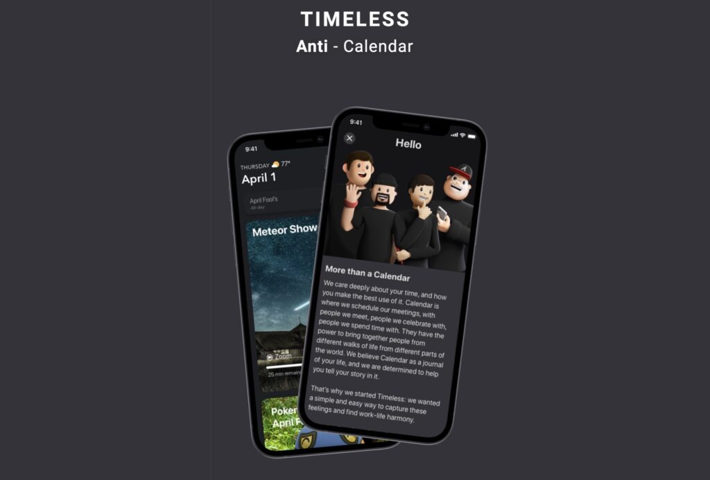
That’s the power of Timeless. A company that cares deeply about your time, and how you want to use it. Their motto is simple: “We believe a calendar is a journal of your life—let us help you tell it.”
The story of Timeless began while one of the cofounders was working on Google Now. There was deep user engagement for a product that was essentially a time management tool but behaved very differently. Instead of focusing on dumping as much information as possible on you, Google Now was constantly centering around giving you just what you need, when you need it. And by creating a platform out of a tool, each recommendation was not only insightful but actionable.
It was through that experience, and from leading the creatives on Android, that the large-scale ambition of Timeless came to fruition. How can Timeless do what platforms like Uber did to Google Maps, for Google Calendar, taking a base infrastructure and creating a platform-marketplace to solve their real problems? Instead of just trying to show you how to get something from point A to point B, what if we did it for you? Instead of just dumbly regurgitating your schedule as a productivity tool, what if a calendar could integrate joyful moments and experiences into your day?
How can a company live up to this though, where so many have failed? There have been countless discussions on why calendars suck, but nobody has ever seemed to crack it.
Calendars unfortunately always end up in two buckets: unusable for your work and life, or becoming yet another productivity tool. For a product to work for the everyday user, it has to accommodate life outside of the 9 to 5. To solve this, Timeless maintains a maniacal focus on each user interaction, centered around actions to fit different parts of your life. This is a game-changer as it comfortably can be used for everything, not just with scheduling the groan-worthy corporate event invitations. Putting aside how sleek and polished it all is, this is the most important part, as Timeless becomes an extension of how people actually manage their events.
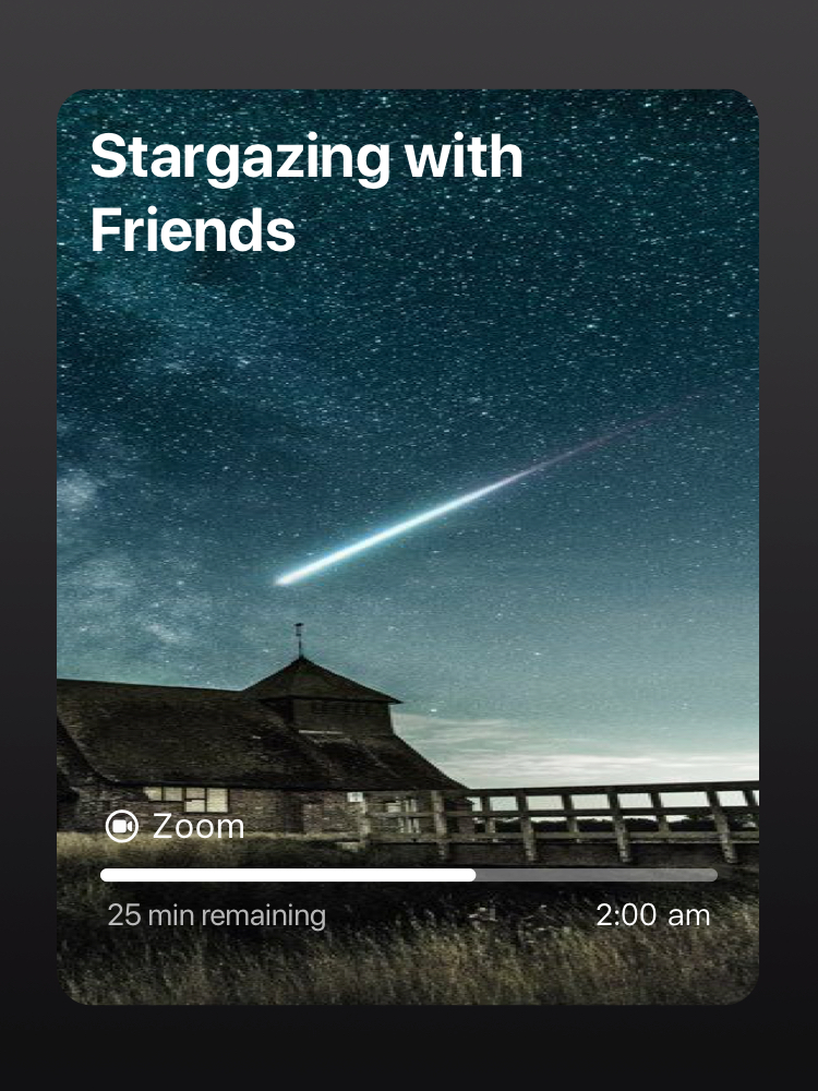
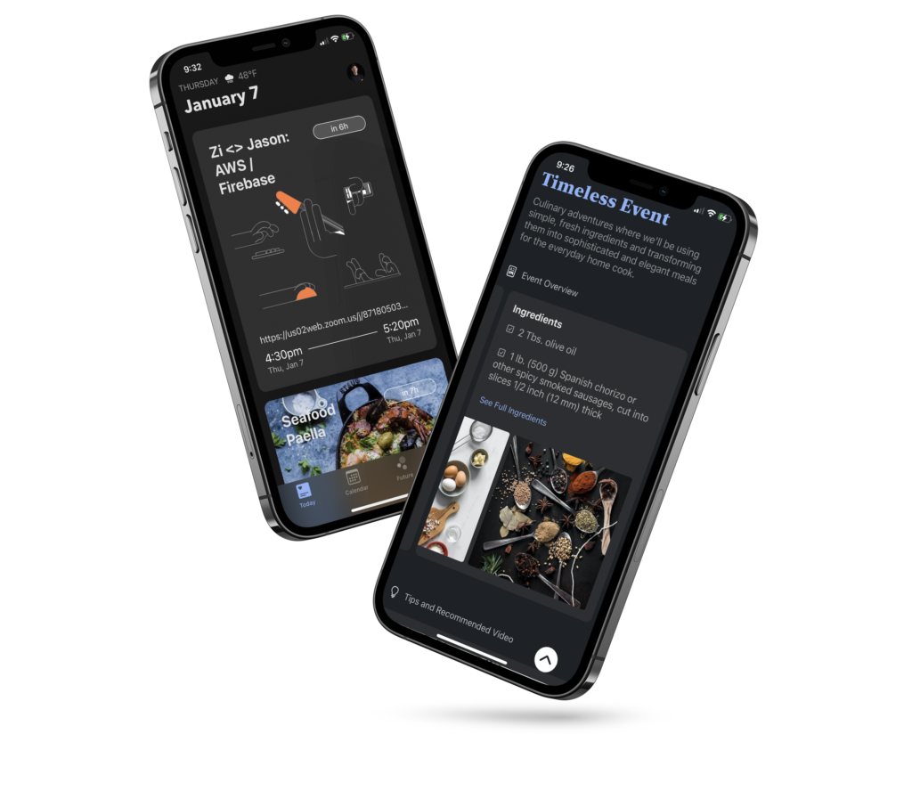
When it is time for meetings, you can immediately see all the details of what’s next through the hyper-focused Today view, join the meeting with a single tap, send quick messages if you’re running late, or get a breakdown of the rest of the day in the calendar view of your choice. But, anytime you need to switch off work, just toggle to only show the personal calendar groups, or “calendar sets”, (you can have things like wellness, family, and personal sets) and relax with their fun event-specific images. And soon, you’ll be able to use Timeless to access rich experience integrations, like cooking events with built-in recipes; all through their feed for events and calendars.
A lot of focus has also been put into the event organizing experience. Let’s be honest, nobody has opened a calendar invite and said, “wow that’s really fun”—calendar invites almost always feel like a chore instead of the powerful social tool that they are. With Timeless, there is the regular invite with an email option, but they also have the surprisingly delightful Web RSVP feature which lets you create a shareable link for any platform you use. And that same unique rich Timeless content is still there for the invitees to use, without having to download Timeless or feel like a corporate invite.
Timeless is far from perfect though. It doesn’t have all the bells and whistles you would expect from a more mature product, including searching for events, a desktop version, or some of the more nuanced calendar features like `this and following` event updates. But there is a sense of a method to the madness. One can see the vision behind the enormous event images. What if in its place was more dynamic content like flight details, or the score of a game, or a live stream you’re trying to watch? The fact that the app puts experiences first, and time second, allows you to shape my time around the things you care about, rather than shaping the things you care about around your time. The UI feels easy to consume like at some point it will be used to peruse for interesting services and experiences to schedule.
There is still a long way to go; it is a big vision. It invites only, in true Silicon Valley fashion, and only supports google calendar and iPhones. If you are the 1% of calendar users who care about solely maximizing your productivity and being held at the will of a digital Tetris board, this is not for you. But, if you’re tired of constantly looking at a basic grid of your life, then check Timeless out, and join their waitlist.
To join, sign up for their waitlist, or email them at hello@timeless.space.
Media Contact
Timeless Space Inc.
hello@timeless.space
https://timeless.space


